Case study: Developing Creative Wellbeing Packs for an Older Audience
Creative Arts East
During the Covid-19 pandemic, one of the key challenges faced by arts organisations working with older audiences was maintaining engagement whilst physical activities were not possible.
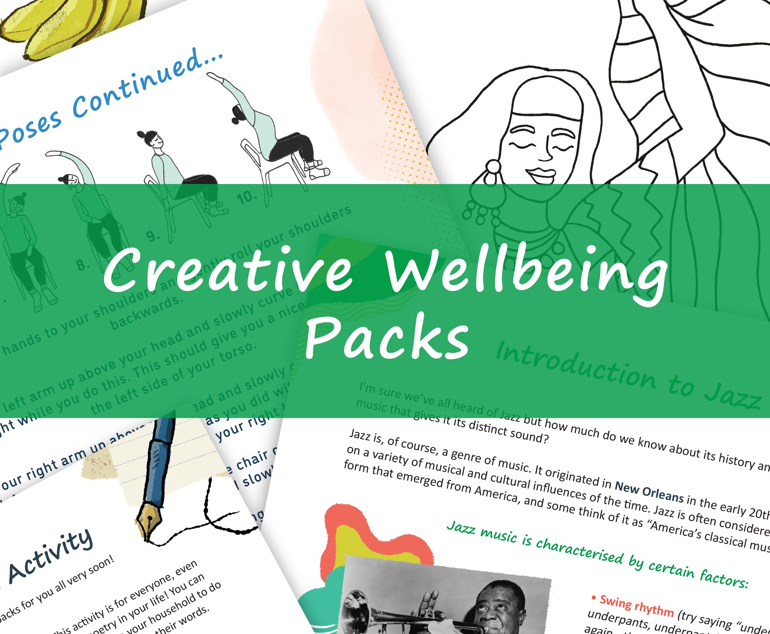
In response to this, Creative Arts East devised and distributed Creative Wellbeing postal packs, designed with the needs of their older audiences in mind. The packs are free of charge and continue to be posted out monthly.
Sophie Clouston, Lead Marketing Officer at Creative Arts East, shares their learnings and advice from the creation of these physical packs.
Before the pandemic hit, our team at Creative Arts East held free twice-monthly music and movement sessions across Norfolk. These were aimed at engaging older people of all abilities, including those living with a dementia or other long-term health conditions, carers and those who feel lonely or isolated. These sessions ran as part of our award-winning ‘Our Day Out’ programme, funded by Spirit of 2012, and will continue to take place once it is safe to do so.
Working in rural, often isolated communities, the news of COVID-19 posed a challenging question for us. How do we maintain the same level of support and interaction with our participants as we have done in person for the last 5 years?
As the world went digital, we had to consider how to create something that worked offline, as many people we work with have limited or no access to the internet and current technology. This is where our Creative Wellbeing postal packs began.

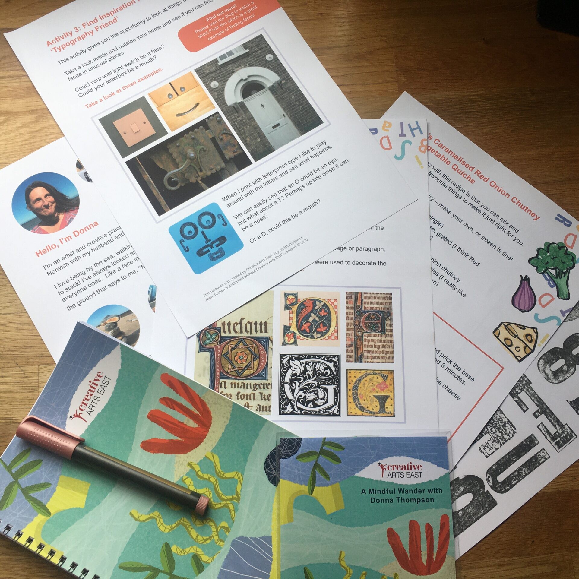
To kick off the process of creating these packs, we start by identifying themes that would be interesting to explore through music and movement. Our wonderful Project Officer Lea then scouts out new and exciting artists to work with. Our packs are created in collaboration with the artist, based around their specialist theme. So far we’ve explored a whole range of artforms, including jazz, opera, typography and Bollywood dance, to name a few, always keeping in mind the music and/or movement focus. Coming up in June 2021, we even have a hip-hop themed pack!
When first liaising with a new artist, it is important to share with them who our audience are, what access requirements should be considered when creating content, along with tips and tricks for developing something clear and user-friendly. Our ‘Artist Guidelines’ document suggests a few ways to do this, including limiting activity instructions to a minimum of 3-5 steps, avoiding jargon or difficult terminology, and utilising images.
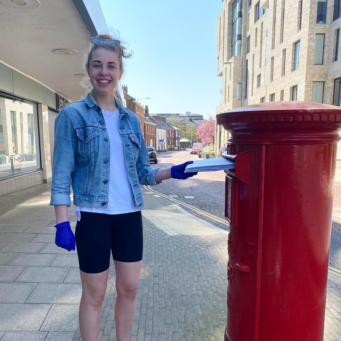
When the content is ready, it is then proofed, edited, and designed in-house before being professionally printed, packed, and distributed by our team. We began with around 100 recipients and are now producing roughly 300 postal packs each month.
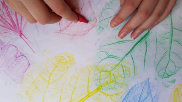
A standard pack is usually made up of an A4 folded booklet, an audio CD reading of the booklet, and any resources needed to complete the enclosed activities. These could range from craft materials to herbal teas, dancing scarves to incense sticks!


The audio CD is not only a great alternative for people who aren’t fond of reading, but it is also beneficial for those with visual impairments, dyslexia or people who are illiterate, and those living with a dementia. We are very open to adapting the packs into new formats for our users, depending on their access needs, and this is something we would urge other organisations to consider when creating content for an older audience.
Here are some tips for creating audio content for an older audience:
- Start with an introduction.
- Ensure there is good sound quality – must be loud enough and clearly spoken.
- Take listeners on a natural journey with you that they can play before or while they try the activity – go at a steady pace, suitable for our older audience.
- Less is more – concise is better than being too detailed.
- Add alternative instructions to your activities for those who face access challenges such as being immobile and lacking resources.
- Use clear and minimal instructions.
In terms of our printed booklets, in the early stages we were so focussed on getting the content out to people that we hadn’t fully considered how it was received by our users. We subsequently spoke to our audience and asked for feedback, which prompted research best practice in this area. Here are some key tips that we learnt:
- Use Arial font, size 16pt (which is defined as Large Print by the Royal National Institute of Blind People).
- Align your text left where possible. Centred or right alignment can be missed.
- Limit the amount of text used and support with photographs or clear illustrations to demonstrate your point.
- Keep written communication bite-sized and simple, but still retaining a high-quality insight into your artform.
- Don’t use too many colours, limit your palette and use contrasting colours that are easy to read.
21 May 2021
FURTHER INFORMATION


